
Here are fifty notable science fiction covers from the golden age of paperback fiction. They’re in rough chronological order and show just how profound the change was during the tumultuous 1970s.
For sure, in the early years of the decade most paperback publishers were still following the loose-limbed 1960s paradigms of messy abstracts, psychedelia and surrealism, and formal geometry. In the U.S. in particular, companies such as Dell dolled their books in covers that wouldn’t have looked out of place in the 1950s. There’s no complaint from me about that. Painterly science fiction design has never been bettered.
In the early 1970s, the designs became even more adept, and even more beautiful. This genre boasts some of the most gorgeous paperback covers ever produced. Just as happened with popular music at the time, the paperback became a canvas for an astonishingly diverse and fiercely creative imagination. And just as with rock LPs, key artists litter the field, those like Chris Foss, Tim White, and Patrick Woodroffe whose work uplift even the most mediocre novel or story collection.
Some of the covers I list below might include older paintings repurposed for the decade, but a great design is more than just a compelling image. The font choice, placement, color, and weight are important too. Many a great cover was ruined by poor type choices, by shouty blurb, by over-fussy text plaques, or by—shudder!—placing the image in a frame.
But just as happened with LP covers, as the decade progressed the imagery was cheapened. Photography had always been a poor man’s choice for speculative paperback fiction. Now it became the easier out for penny-pinching publishers. Star Wars swerved mainstream SF back to pulp illustration. Designs became garish, glossy, and soulless. Welcome, in other words, to the 1980s.
For a short while, as the covers below illustrate, there was a romance to the female form. Now she was back to boob-bait. (To be fair, the 1975 book Wandering Stars: An Anthology Of Jewish Fantasy And Science Fiction had some very blatant boob-bait for what was, in effect, a religious suckering—it sure knew what it had to do to attract an audience that might then be preached to.)
As science fiction codified at the end of the decade, the experiments ceased. Covers were now tailored to their perceived marketplace. There was no more room for the crazier experiments you’ll see below. Science fiction lost its connection and its charm, and when computer typesetting arrived—well, it’s just like CGI in movies. The fitness of the organism became subservient to the novelty of the tech.
Today, of course, the paperback cover is as obsolete as the LP cover, except for those few of us who still treasure the physical object. I wish my own books could have designs a fraction as good as these, but I’m part of the paradigm of this age. I work within my restrictions and choose by necessity so many of the things I just criticized. Forgive me that. At least, with covers such as Born From Ash, I try. There’s still great design out there, but I can’t remember the last time an SF cover leaped from the page as these do.
And before you ask, I know. But here I represent “the 1970s” as any year that begins “197.”
For more on my own love of old paperbacks please read my posts Buy it for the cover and In praise of pulp. For now, sit back and enjoy the time when these little rectangles, no matter how misleading they were, really mattered, and not just on the bookstore shelves.
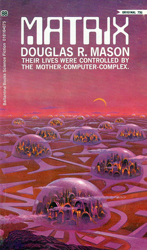
Douglas R. Mason Matrix
1970 Ballantine Painting by Paul Lehr
Cities in domes in a circuitry of interconnections, bathed in cherry and rose. That computer font is right on the zeitgeist. It wouldn’t look old-fashioned today for a genre novel, provided you removed the dot in the M.
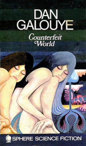
Daniel F. Galouye Counterfeit World
1970 Sphere Painter unknown
This beautiful wraparound cover depicts three iterations of the same woman, presumably representing three layers of reality, sandwiched between cross-sections like something out of The 5000 Spirits or Aoxomoxoa. It’s quite gorgeous, and has almost nothing to do with Galouye’s novel (better known as Simulacron-3 and later filmed as The Thirteenth Floor).
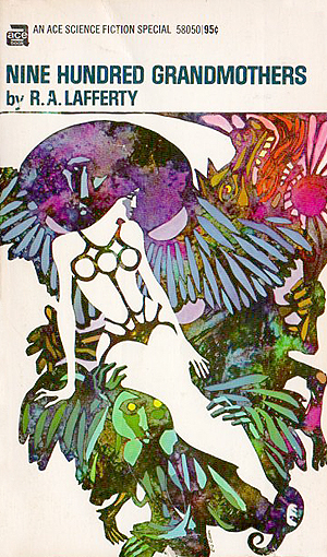
R.A. Lafferty Nine Hundred Grandmothers
1970 Ace Painting by Diane and Leo Dillon
Lafferty’s story collection came in the kind of elegant art we’ve utterly scrubbed from the genre. A sophisticated woman, who may or may not be wearing a corset and may or may not have three breasts, is defined out of absence in a scrabble of masculine monsters.
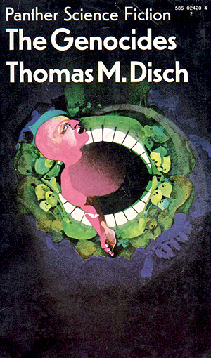
Thomas M. Disch The Genocides
1970 Panther Painter unknown
A gloriously messy, loose, and energetic reading of Disch’s classic about rampant alien plants that are, in this analogy anyway, actively consuming humanity.

J. G. Ballard The Crystal World
1970 Panther Painting by Richard Whittern
I like this novel least of Ballard’s four elemental disaster tales, but Whittern’s illustration for this particular edition is superb. Sunlight sparkles through the encroaching facets, the foreground vegetation is vigorously portrayed, and the whole thing would look like a mainstream novel if it wasn’t for the publisher’s bold declaration at the top. I can see it in schools. Another fine example of what we lost.
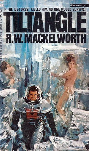
R. W. Mackelworth Tiltangle
1970 Ballantine Painting by John Berkey
It’s likely not an author or a title you recognize, and given Berkey’s frantic, painterly cover you might even think it an Ian Fleming or Alastair MacLean novel. We did recover some of this style of SF illustration, but no longer with the naked girls in ice cubes.
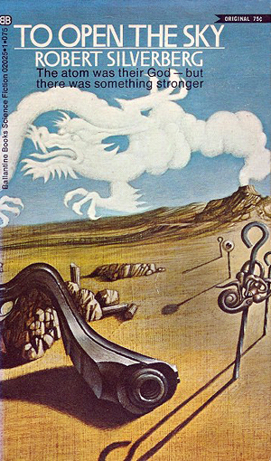
Robert Silverberg To Open The Sky
1970 Ballantine Painting by Tom Adams
The first of two Adams paintings in a row here, both of them riffs on surrealistic painters. This is obviously a Dali parody, though Dali would never have been as gauche as to draw a dragon coming out of a volcano. The novel is not one of Silverberg’s best, but you’d likely not know the genre without the byline to guide you.

Brian N. Ball Timepivot
1970 Ballantine Painting by Tom Adams
Something of a bumper year for Adams, whose other work in 1970 included excellent covers for Robert Silverberg’s Needle In A Timestack and, in particular, Thorns. This one is more striking than the book deserved, and again has touches of Dali though I think Adams has Magritte more in mind.

James Blish The Star Dwellers
1970 Berkley Medallion Painting by Paul Lehr
A similar color scheme to his Matrix above, Lehr here immerses us in a foggy field of underwater translucence, not particularly hot, in which an alien-as-planet-as-submarine drifts out of a cloudy haze. Despite its human grappling hooks, the thing doesn’t particularly suggest menace.
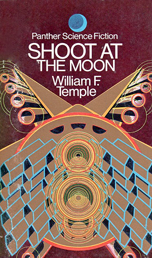
William F. Temple Shoot At The Moon
1971 Panther Painting by Peter Tybus
Most Tybus illustrations are gaudy fantasies, but this is nicely abstract, suggesting a cross between a warship bristling with cannons and some streamlined space cruiser. The moon itself, in case we didn’t get the double meaning of “shoot,” is up there at the top masquerading as a corporate logo.
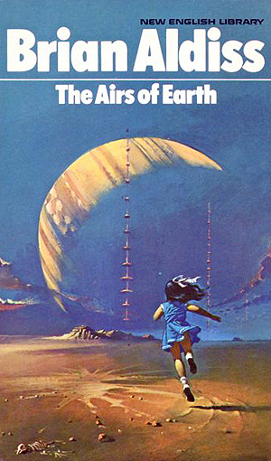
Brian Aldiss The Airs Of Earth
1971 NEL Painting by Bruce Pennington
The first of prolific cover artist Pennington’s covers here, and the first for Brian Aldiss, who seems to be the author most closely associated with good quality paperbacks at this time. (He was respectable enough for crossover appeal, I presume.) On a non-solar system moon, a human girl runs toward a gas giant, blue dress billowing. Ahead of her enigmatic structures pierce the sky. Under her feet, a long dead bird. Whatever unlikely thing is happening here, it is an image that pulls you in at once.
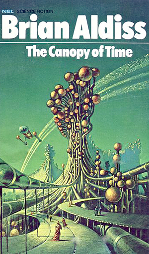
Brian Aldiss The Canopy Of Time
1971 NEL Painting by Bruce Pennington
Retro it might have seemed by 1971, but Pennington’s alien world is exactly the kind I like best, and this is certainly one of my very favorite covers. I could do without the flying machine center left, but the rest is brilliantly weird, suggesting truly otherworldly architecture.
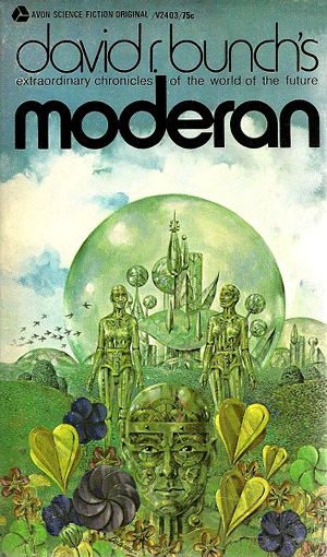
David R. Bunch Moderan
1971 Avon Painting by Norman Adams
Oddly, this was Bunch’s only contemporary pressing of his key work. It’s only been in physical print in English once since. I wouldn’t have put his name in possessive since he wrote every one of the stories inside, but the font choice is note perfect.

J. T. McIntosh Flight From Rebirth
1971 Avon Painting by Paul Lehr
Tear your eyes from another foggy Lehr landscape, this one oppressively rufous, and savor that immaculate typesetting. Note how the shallow gap in the surname makes it easier to read. A pulp masterpiece.
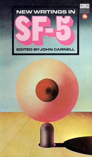
New Writings In SF-5
1971 Corgi Painter unknown (design by “Solution”)
For this reprint, Corgi decided on a near abstract design in which, if you’re that way inclined, a giant generalized breast is being poked by a finger. Whatever this is it’s not our current paradigm of science fiction, and I’ve included it for that reason. Believe it or not, SF was once marketed in these terms. Indeed, I’ve even seen sexy covers for books by Arthur C. Clarke! Since Clarke was by this time writing solely for Playboy, you can understand Corgi’s intention: to market the genre to sophisticated (but slightly disreputable) male adults.
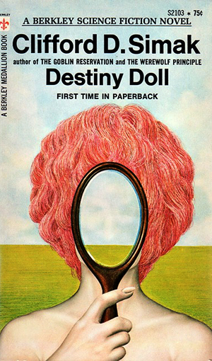
Clifford D. Simak Destiny Doll
1972 Berkley Painter not known
Not a great Simak novel, but a very typical cover for its age. Today we imagine this to be how magic realists like Angela Carter were marketed. There is not, incidentally, anything specifically surrealistic about this image, except to ask where the observer is.

Rosel George Brown The Waters Of Centaurus
1972 Lancer Painting by Gene Szafran
On the surface, this is blatant titillation for male readers, though the figure is beautifully painted against an exuberant background of peacock sprays and 1960s flock wallpaper. However, her haughty expression separates her from the usual come-on. Brown was actually a female writer, and this is from a series about a strong, independent woman.
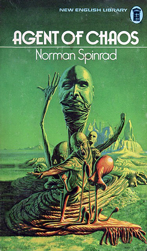
Norman Spinrad Agent Of Chaos
1972 NEL Painting by Richard Clifton-Dey
Repellently mixing glowering green and visceral red, Clifton-Dey’s The Thing-preempting image was gruesome and striking enough to be used twice more for different books in the same decade!

Brian Aldiss The Primal Urge
1972 Sphere Painter not known
Aldiss’s well-traveled adult novel here gets the best cover of its long career. Most of its rivals, to be fair, are naked women, sometimes with men leering at them. This one is absolutely lovely, and something you might even leave lying around. The figure on the left, I think, is male.
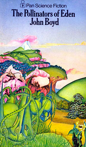
John Boyd The Pollinators Of Eden
1972 Pan Painter unknown
It doesn’t look science fiction at all, though those plants are obviously not terrestrial. Neither does it have much of a fantasy feel. The book’s enigmatic churn, pleasing asymmetry, fine color scheme, and enticing obscurity make this quite likely my favorite non-tech book cover of all time. It’s so much better than the novel itself.
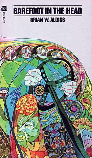
Brian W. Aldiss Barefoot In The Head
1972 Ace Painting thought to be by Diane and Leo Dillon
I know what you’re thinking. Here am I, author of books like Trippersonics, Fantastic Trips, The Music Of The Rending Of The Night, and Grand Funk Central, and who adores Angela Carter’s The Internal Desire Machines Of Doctor Hoffman, so Barefoot In The Head should be right up my street. Nope. I’ve tried several times and never managed to get all the way through the thing. But I love this cover. It’s not just psychedelia: there’s real energy in the breakneck way in which that goggled driver is hurtling through his psychic landscape. See how tightly his teeth are clamped on the shift stick.
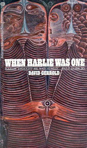
David Gerrold When Harlie Was One
1972 Ballantine Painting by Jacques Wyrs
Wyrs’s illustrations were generally more painty than this (we’ll meet another of them below) and I do wonder how much this was actually inspired by the brief. Little, I’d guess. But it’s finely and compellingly strange, suggesting to me African necklaces and Aztec designs.
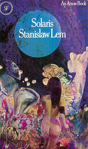
Stanislaw Lem Solaris
1973 Arrow Painting by Chris Yates
Cultural icon it may be, but Lem’s novel hasn’t received the cover image attention you might expect. The best known edition is probably a Faber And Faber release from 1991, which certainly did try to infuse it with mainstream significance. In complete contrast, I would expect this marvelous wrap-around Arrow version to be targeted at juvenile readers, except the buttocks might not allow it. Today, anyway.

J. G. Ballard The Disaster Area
1973 Panther Painter not known
The brief, let’s say, was something with seagulls. Defiantly contrasting flesh pink and mounds of pistachio, the cover is one of those subtle surrealistic paintings that typify the period for me.

Barry N. Malzberg In The Enclosure
1973 Avon Painter not known
There’s something neatly modern about this image—I can imagine authors using it today, though perhaps with less panache in the face—and it’s especially notable that the designer placed the text at the bottom of the cover, just as I do in my own books. That’s also some truly great typesetting, yet again from Avon.
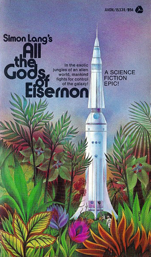
Simon Lang All The Gods Of Eisernon
1973 Avon Painting by Gene Szafran
Another curious possessive for the author, and some more of that immaculate Avon typesetting. Here’s a flat, Rousseau-like landscape in which are nestled a tiny spaceship and even tinier humans. I could do without all those shouty exclamation marks, but there was only so much elegance Avon’s readership would tolerate.

Frederik Pohl and Jack Williamson Rogue Star
1973 Ballantine Painting by Jacques Wyrs
Weird and messy, complex and naive, but there’s just enough of those Harlie layers to suggest this really is the same Wyrs. Ballantine’s flowery text tries hard, but even its flourishes are lost in the image.
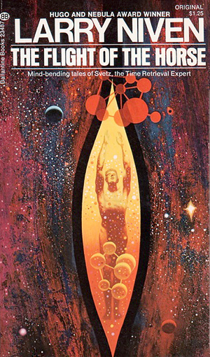
Larry Niven The Flight Of The Horse
1973 Ballantine Painting by Dean Ellis
Breasts would be one thing, but surely veteran designer Ellis and above-drinking-age publisher Ballantine were both perfectly aware that this cover evokes a vagina. The book itself, of course, a short story collection, can only disappoint.
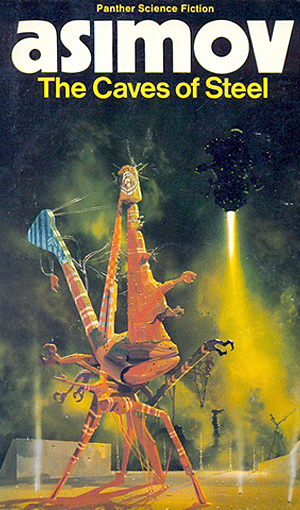
Isaac Asimov The Caves Of Steel
1973 Panther Painting by Chris Foss
I already posted my disgust at being suckered with this terrible novel on the strength of Foss’s magnificent cover. And regardless of Asimov’s elderly pot boiler, this cover also found its way into my survey of plausible science fiction, The Smart Core Manifesto, which you should own of course. So I need say no more.
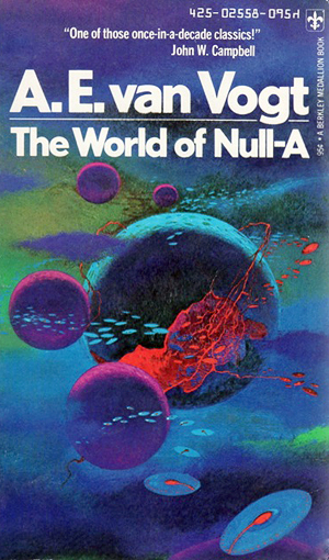
A. E. Van Vogt The World Of Null-A
1974 Berkley Medallion Painting by Paul Lehr
Lehr’s work to lift this ancient novel (first published in 1948) is here still more sumptuous than the others I’ve chosen, an unlikely blaze of saturated blues and purples in which equally unlikely moons joust with Arnold-style flying saucers. None of this should work, but the cover has a vigorous excitement that makes you want to read the book, and the typesetting is superb.
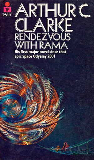
Arthur C. Clarke Rendezvous With Rama
1974 Pan Painting by Bruce Pennington
From an old classic to a new one. Pennington’s atmospheric painting for this first paperback edition brilliantly reflects Clarke’s sense of wonder. Its tiny humans on their long descent draw your eye in toward the glories of the cylinder beyond. But it’s also backwards. The earlier hardback edition cropped down and reorganized this same design to something that was brash, more abstract, less engaging. Neither did publishers seem to realize they were in the presence of greatness. Every subsequent cover has been awful.
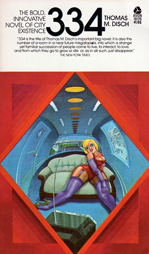
Thomas M. Disch 334
1974 Avon Painter not known
This painting leaps off the cover, subverting science fiction tropes for something that is classy, urban, sexy, and very funny. We glimpse, as if through an only slightly vaginal spy hole, a woman in her underwear sprawled before a TV. She is languorous, disdainful, but also invites our voyeurism. The colors blaze. The image wants to draw us in. It’s certainly not what the genre is supposed to represent.
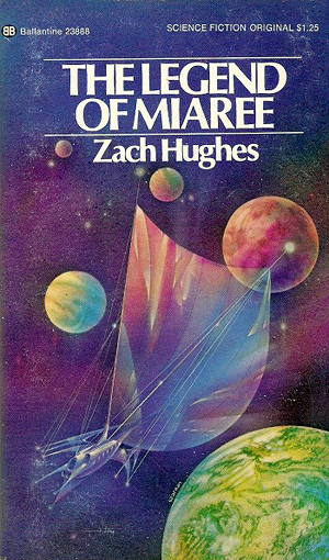
Zach Hughes The Legend Of Miaree
1974 Ballantine Painting by Gene Szafran
A minor work that you probably don’t remember, but Szafran’s design is nicely poised between retro science fiction (all those planets crowded together just like the moons on the Paul Lehr we saw a couple of covers ago) and a romantic fantasy of sailing sunjammers through colorful space. None of it in the least plausible, but compelling.
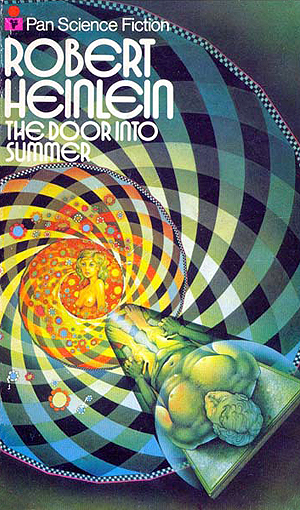
Robert Heinlein The Door Into Summer
1974 Pan Painting by Patrick Woodroffe
Heinlein’s well-loved time travel adventure has traded intermittently off its female love interest ever since the daringly nude cover to its second episode in The Magazine Of Fantasy And Science Fiction back in November 1956. And yes, here most explicitly is boob bait at the end of the tunnel. (And it is a time tunnel, a little obviously.) But Woodroffe’s image swirls with vertiginous movement, slipping the viewer as much into the depths of the design as the bulge-crotched hero.
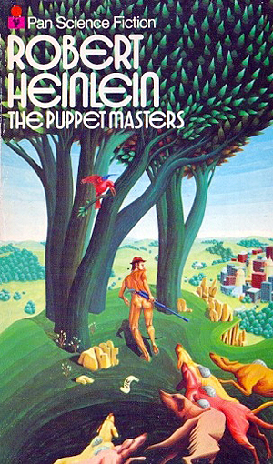
Robert Heinlein The Puppet Masters
1974 Pan Painting by Bob Fowke
Of all the different ways this classic Heinlein could have been treated, Fowke’s image is easily the most surprising. It stands out among the book’s imprints even in a strand so rich in great illustrations. There’s no saucer, and no man on strings. Instead this is resolutely a mainstream novel approach, and that may have been its intention. Here’s a hunter with his dogs, moving through American woodland. But peer closely at the dogs, and just look at the way those trees move.

William Rotsler Patron Of The Arts
1974 Ballantine Painting by Tom Adams
We’ve met Adams before, doing his variations on surrealist artists. Here’s a terrifically posed medical fantasy for a humdrum book, both ecstatically sensual and repugnant. The same image was later cropped and robbed of all its power for a Robert Silverberg novel Capricorn Games, across which Pan smeared its late-1970s text boxes.
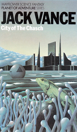
Jack Vance City Of The Chasch
1974 Mayflower Painting by Peter Goodfellow
I’m probably right in saying that Vance’s Planet Of Adventure quartet is not fondly remembered, and is likely not high on your list of things to read. But Goodfellow’s illustrations for this particular run of reissues are all elegant, mainstream-yearning treatments that lift the work immeasurably, and the simple strong type is utterly modern. City Of The Chasch has a different effect than the other three, strongly suggesting S. Fowler Wright. I list one of the later volumes below.
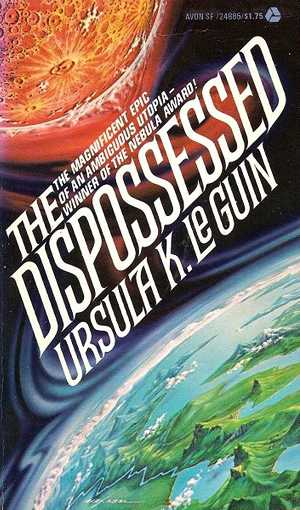
Ursula K. Le Guin The Dispossessed
1975 Avon Painting by Alex Ebel
Ebel’s painting shimmers alluringly in contrasting coolness and heat, across which Avon had no choice but splash its title at a bellowing angle. (And yes, it’s complete with exclamation mark.) The colors are everything here, since the title means you can’t quite grasp how the two bodies—a fantasized Earth and Moon—interact.
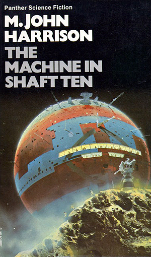
M. John Harrison The Machine In Shaft Ten
1975 Panther Painting by Chris Foss
Foss was rarely one to actually read the books he illustrated. Often publishers would slap on an unrelated Foss painting simply because it looked so good. In this case, unfussy writing complements a particularly strong Foss image of a vast pre-Star Wars sphere in space, rising ominously from behind a fortified asteroid. To show just how Foss shaped our collective future, I can easily imagine this same image, complete with the same typesetting, to sell a novel by Iain M. Banks.

Jack Vance The Pnume
1976 Mayflower Painting by Peter Goodfellow
The three other volumes in Vance’s Planet Of Adventure saga were the unfortunately named Servants Of The Wankh, The Dirdir, and this concluding episode. All three have excellent covers in Pan’s run of reissues, with this Bosch-style landscape a standout.
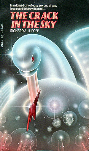
Richard A. Lupoff The Crack In The Sky
1976 Dell Painting by Peter Lloyd
I’d forgive you if this novel doesn’t ring a bell. I can’t remember much about it myself. And it’s one of only two novel covers that Lloyd designed, the other a resolutely undistinguished half of an Ace Double. But just look at all that glowing airbrush work, just a few months after the release of Camel’s LP The Snow Goose.
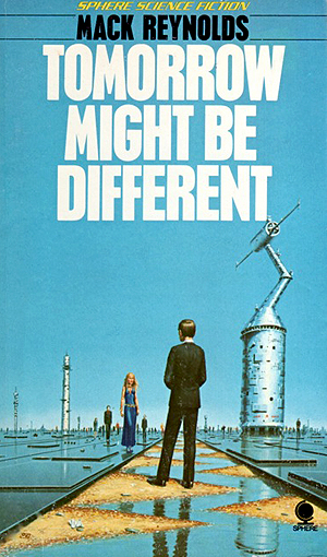
Mack Reynolds Tomorrow Might Be Different
1976 Sphere Painting by Peter Elson
Again, this isn’t much of a novel to care about, but Elson (probably best known for the classic paperback cover to Clarke’s 2001) dolls it in a brilliantly enigmatic mock-surrealism cover in which spies approach each other over a flooded technological no man’s land. The big sky is a broad canvas, and to my eye demands a left-justified title, but Sphere still somehow managed to overlay text on part of the design.
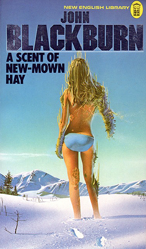
John Blackburn A Scent Of New-Mown Hay
1976 NEL Painting by Tim White
Blackburn’s scary 1958 novel—about Nazi human experiments that unleash a fatal fungus that kills only women—was reaching the end of its life here. This was its last new edition. A 2013 version by Valancourt dolled it in a retrospective cover reproducing its first hardback edition. But what a way to bow out, with one of the earliest Tim White covers which somehow manages to be both sexy and horrifying. I swear those pants were added later but they won’t scratch off my copy. The scene may, at a pinch, be in the novel. This is another of my top ten all time paperback covers for sure.
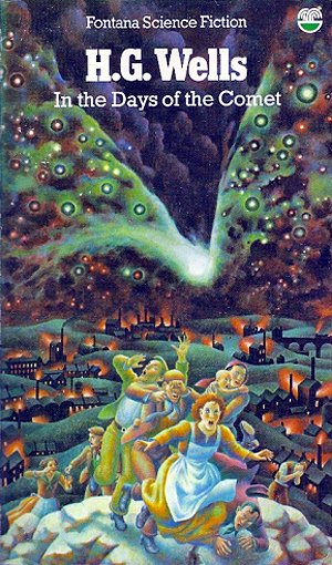
H. G. Wells In The Days Of The Comet
1978 Fontana Painting by Justin Todd
The oldest novel in this list by far (it’s from 1906) here receives its best cover. Todd, a remarkably fine painter for such a tawdry genre, would go on to paint what I consider the “classic” version of Kurt Vonnegut’s Cat’s Cradle, the one with Vonnegut’s head in billows of nuclear smoke, but that was released in 1980 and falls just outside what I here consider the 1970s. I’m surprised he didn’t do more work for Penguin, since this has all that company’s mix of mainstream appeal and school library focus.
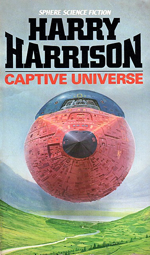
Harry Harrison Captive Universe
1978 Sphere Painting by Angus McKie
I wonder if this was a McKie purposed at random to sell this book? Anyway, it has only marginal relevance to a novel about Aztec spacefarers, and may be as coincidental as the way the spaceship’s curves echo the curve of Harrison’s name. (Surely somebody at Sphere should have noticed the two don’t line up? More sloppy type work from that company.) But McKie’s image is the seller here: boldly placed (I swear he was staring into the nib of the pencil used to draw it) and enigmatic, the tip of what I assume to be a lengthy cylinder though the shadow is confusing. It shouldn’t get wider over the mountains. Whatever: just a big dumb object covered in Star Wars kipple and one of the worst suckerings of the period.

John Boyd The Rakehells Of Heaven
1978 Penguin Painting by Peter Cross
We met another Boyd novel earlier, The Pollinators Of Eden, and that book also received a fine Penguin cover in 1978. For all that Penguin was the epitome of mainstream, middle class book design, the company was never actually that distinguished in science fiction, misfiring more than it succeeded. Even here, art is seen to trump genre, though the bold tone choice is compelling enough.

Alfred Bester Star Light, Star Bright
1979 Fontana Painting by Tim White
Fine color, design simplicity, and sheer strangeness win out for this Bester short story collection. The object is a clunky, retro spaceship, all dog-faced air ducts under a paranoid fortress bristling with antennae.

Brian M. Stableford Critical Threshold
1979 Hamlyn Painting by Tim White
Another White painting, quite in contrast to the last, and proof that even here in the closing months of the decade the genre could still throw up classy covers that entice and surprise. Hamlyn had only just started targeting paperbacks to science fiction readers, which may be why this image has a slight uncertainty of tone: it could be a fantasy novel with mainstream appeal. Still, look at the way it draws you into those disconcertingly familiar depths.

Fred And Geoffrey Hoyle The Inferno
1979 Penguin Painting by Adrian Chesterman
I’m not going to lie to you. I detest the series of paintings Chesterman created for Penguin in 1979. They’re garish, crayon-colored, and all but guaranteed to make me heave. (Look what Chesterman did to The Traps Of Time, surely the best time travel anthology ever released. Ugh, ugh, ugh.) And for sure the Hoyles’ novel, in this its last ever edition in print, writes its own image: Mother Earth is burning so let’s show Mother Earth burning. But it does work in this particular case. It is embarrassingly childish, but it does fit the novel and is positioned dead center at its teen readership.

Michael Coney Charisma
1979 Dell Painter not known
And a final step down before the decline. The brashness and silliness of this image is undeniable, but it leaps off the page, and I could even see this on the cover of an issue of OMNI. The type is less compelling. The title itself is a mess (look at the way the S butts the M). The only thing it lacks is the exclamation mark in the tagline. What gives, Dell?
Almost all these covers were borrowed from the Internet Speculative Fiction Database since the ones posted there are usually in better condition than my own hard copies. I’ve color corrected, cropped, and otherwise messed with the images, so please go to the ISFDB for the originals if you want to reproduce them.
